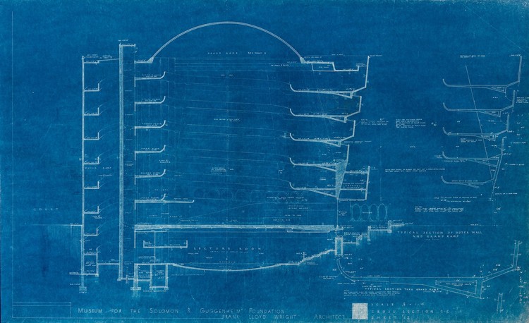
In a recent blog post from the Solomon R. Guggenheim Museum, curator Ashley Mendelsohn explores unrealized design details from Frank Lloyd Wright’s iconic design in New York City, based on blueprints and drawings from the museum’s archives. From large-scale questions of form to material choices, the 16-year period between the commission and the completion of the museum saw many design iterations. Most notable of these are the circulation paths drawn by Wright in the 1953 blueprints that include a steeper circular ramp—in addition to the "Grand Ramp"—that would allow for expedited access to the floors. Though replaced later with a triangular staircase, the "Quick Ramp" demonstrates Wright’s exploration of overlapping geometries.


Wright’s "Index of Surface Finishes" drawing shows another study the building went through during the design process. As Mendehlson explains, “Wright did not initially plan for the exclusive use of terrazzo flooring. Both the Grand and Quick ramps were designated 'CF' for cork flooring. Only the rotunda floor is labeled with the 'TF' for terrazzo. It’s unsurprising that cork was eventually ruled out, as it would have been both expensive and difficult to maintain. Be that as it may, this early material specification speaks to Wright’s vision of the museum as a social space; cork flooring would have absorbed sound, ensuring an entirely different acoustic quality in the rotunda.” The collection also features photographs of the physical model made in 1945 to help the public visualize the unconventional design. Though the dome pattern has since changed, the model is strong in its use of section to convey Wright’s vision of connectivity and light that remains today.


To learn more about the Guggenheim’s design history, and the decisions that led to the building that now stands, read the original article by Ashley Mendelsohn on the Guggenheim blog here.


